Greg Wilson from Software Carpentry posted a plot challenge yesterday evening: http://software-carpentry.org/blog/2015/02/plot-this.html#comment-1845097980
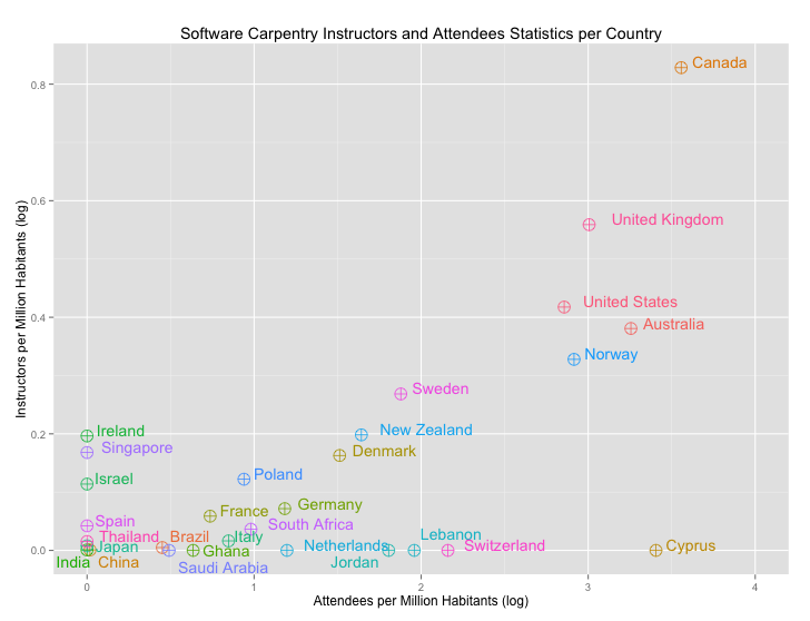
The challenge was to redo this figure to maximize visual information.
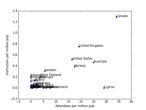
Here is what I would do for a static plot:
library(ggplot2)
per.capita <- read.csv(“~/Desktop/per.capita.csv”)
# New variables
per.capita[,5]<-(per.capita$Attendees)/(per.capita$Population/1000000)
per.capita[,6]<-(per.capita$Instructors)/(per.capita$Population/1000000)
colnames(per.capita)[5]<-“xvar”
colnames(per.capita)[6]<-“yvar”
# This is just to adjust tags so they don’t overlap
per.capita[,7]<-c(0,-0.5,0,1.5,0,0,0,0,0.5,1.5,0,0,0,0.5,1.5,-1,0,0,0,0,2,0,0,0,0,0,0,0,0)
colnames(per.capita)[7]<-“vjust”
per.capita[,8]<-c(-0.2,-0.2,-0.2,-0.2,-0.2,-0.2,-0.2,-0.2,-0.2,0.9,-0.2,-0.2,-0.2,-0.2,1.2,-0.1,-0.2,-0.2,-0.2,-0.2,-0.1,-0.2,-0.2,-0.2,-0.2,-0.2,-0.2,-0.2,-0.2)
colnames(per.capita)[8]<-“hjust”
# Plot
(ggplot(per.capita, aes(x=log(xvar+1), y=log(yvar+1), color=Country))
+ theme(legend.position=”none”)
+ geom_point(shape=10, size=5)
+ scale_x_continuous(limits=c(0,4))
+ geom_text(aes(label=per.capita$Country, vjust=per.capita$vjust,hjust=per.capita$hjust))
+ xlab(“Attendees per Million Habitants (log)”)
+ ylab(“Instructors per Million Habitants (log)”)
+ ggtitle(“Software Carpentry Instructors and Attendees Statistics per Country”))
I also noticed there were some great Ipython interactive maps, definitely going to try something like this: http://nbviewer.ipython.org/gist/jiffyclub/3f3cc34745da55f36fcf